About this presentation
This presentation was given at the HTML5 Now and Next meet-up held at Adobe Systems on Dec. 5th 2011 in San Francisco, CA. The slides are supporting the presentation, and do not have enough textual information to be understood by themselves.
You can see a video of the presentation here.
The presentation is written in HTML5 and uses some features that are only supported by the most modern browsers. It was developed with the latest Chrome browser version and tested on Firefox 8.
You can navigate with the left and right arrow keys and with the up/down keys to drill into sections.
web visual effectsnow and next
Created with CSS 3D Slideshow - by Hakim El Hattab
follow along
http://tiny.cc/q8c6a
agenda
- definition and demos
- how does it work?
- more demos
visual effect
For the purpose of this talk
Techniques that
alter and enhance
the rendering of
HTML5 content.
example: shadows
icons, from the Noun Project
example: chiseled
toggle filter
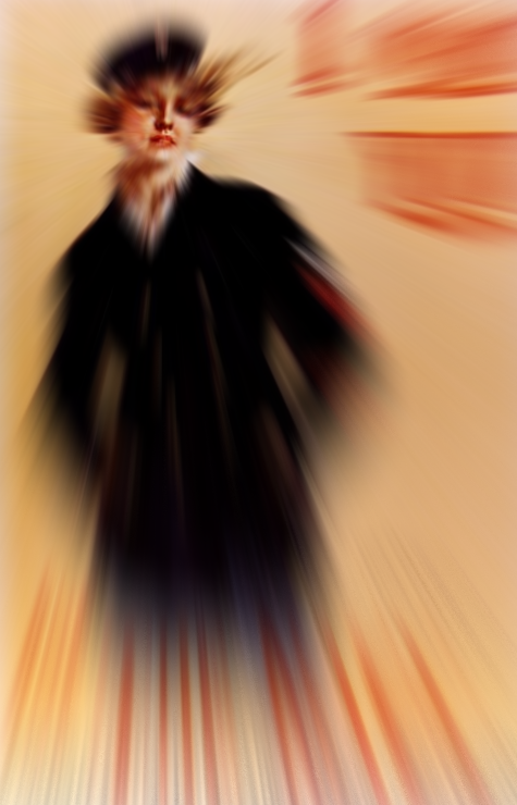
example: shader effects
graphics models
how do I create effects?
effects with canvas 2D
World War I Navy Recruiting Poster by artist Howard Chandler Christy, 1917. (U.S. Naval Historical Center Photograph NH 81543-KN)
var pixels =
     ctx.getImageData(0, 0,
                      c.width,
                      c.height);
var d = pixels.data;
var n = d.length;
for (var i = 0; i < n; i+= 4) {
    d[i] *= scale;
    d[i + 1] *= scale;
    d[i + 2] *= scale;
}

ctx.putImageData(pixels, 0, 0);
click on poster to apply or remove effect
effects with webGL

boiler plate for webGL is 200+ lines
effects on DOM nodes
filter shorthands
<div id="my-element">...</div>

<style>
#my-element {
    filter: grayscale(1);
}
</style>
- grayscale
- sepia
- saturate
- hue-rotate
- invert
- opacity
- gamma
- blur
- sharpen
- drop-shadow
See the Filter Effects 1.0 shorthands specification
filter graph
cloud, by the Noun Project
filter graph
<filter id="drop-shadow" x="-10%" y="-10%"
    width="150%" height="150%">
    <feGaussianBlur in="SourceAlpha"
                    stdDeviation="6"/>
    <feOffset dx="4" dy="4"/>
    <feMerge>
        <feMergeNode/>
        <feMergeNode in="SourceGraphic"/>
    </feMerge>
</filter>
filter graph
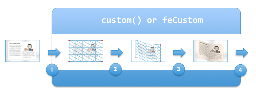
css shaders
- custom filter effects
- provide a way to apply GPU accelerated filters to HTML5 content
- offer pixel manipulation and rendered geometry manipulation
css shaders model

css shaders
<style>
#myElement {
    filter: custom(url(flag.vs) url(scale.fs),
                   20 20,
                   txf rotateX(30deg),
                   amount 0.5);
}
</style>

<div id="myElement">..</div>
vertex shader
precision mediump float;
attribute vec4 a_position;
attribute vec2 a_texCoord;
uniform mat4 u_projectionMatrix;
uniform mat4 txf;
varying vec2 v_texCoord;
const float PI = 3.1415;
const float degToRad = PI / 180.0;

void main()
{
  v_texCoord = a_texCoord;
  vec4 pos = a_position;

  float phi = degToRad * 90.0;
  pos.z = 40.0 * cos(pos.x * PI * 2.0 + phi);

  gl_Position = u_projectionMatrix * txf * pos;
}
fragment shader
precision mediump float;
varying vec2 v_texCoord;
uniform sampler2D u_texture;
uniform float amount;
void main()
{
    vec4 tc = texture2D(u_texture, v_texCoord);
    gl_FragColor =
         vec4(tc.rgb * amount, tc.a);
}
filters with transitions and animations
#my-element, #my-other-element {
    transition: filter 0.5s linear;
}

#my-element {filter: grayscale(1);}
#my-other-element {
    filter: custom(url(wobble.vs), amount 0);
}

#my-element:hover {filter: grayscale(0);}
#my-other-element:hover {
    filter: custom(url(wobble.vs), amount 1);
}
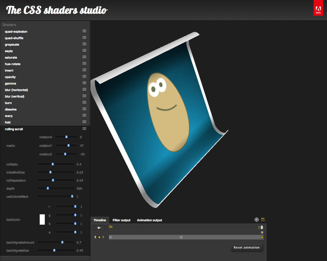
CSS shader studio

take aways
available now
- Filter effects are available in 2D/3D canvas but do not apply easily to DOM content.
- SVG filter effects are available in major browsers: IE, Chrome, WebKit, Opera, Firefox.
- the
foreignObjectelement can be used to apply SVG filters to HTML content (not in IE). - combining
<canvas>and SVG filters can offer a good solution for performance issues, until implementations improve and shaders are widely available
take aways
available soon
- the 'filter' property will soon apply to all content, not just SVG.
- the 'filter' property will soon allow predefined, simple to use filter effects.
- SVG filter graphs will apply to all content, through the 'filter' property
- fully custom, high performance effects are coming with CSS shaders.
take aways
hopes
Animated filter effects should contribute to enhanced user experiences in subtle and useful ways.
attributions
- Slide tool by Hakim El Hatab
- Icons from the Noun project:
- cloud, and camel by the Noun Project, not public domain
- other icons are from the Noun project and public domain
- Fonts: Vollkorn, Ubuntu and Lobster
- Navy recruiting poster from the Naval History and Heritage web site.